Advances in Water Research
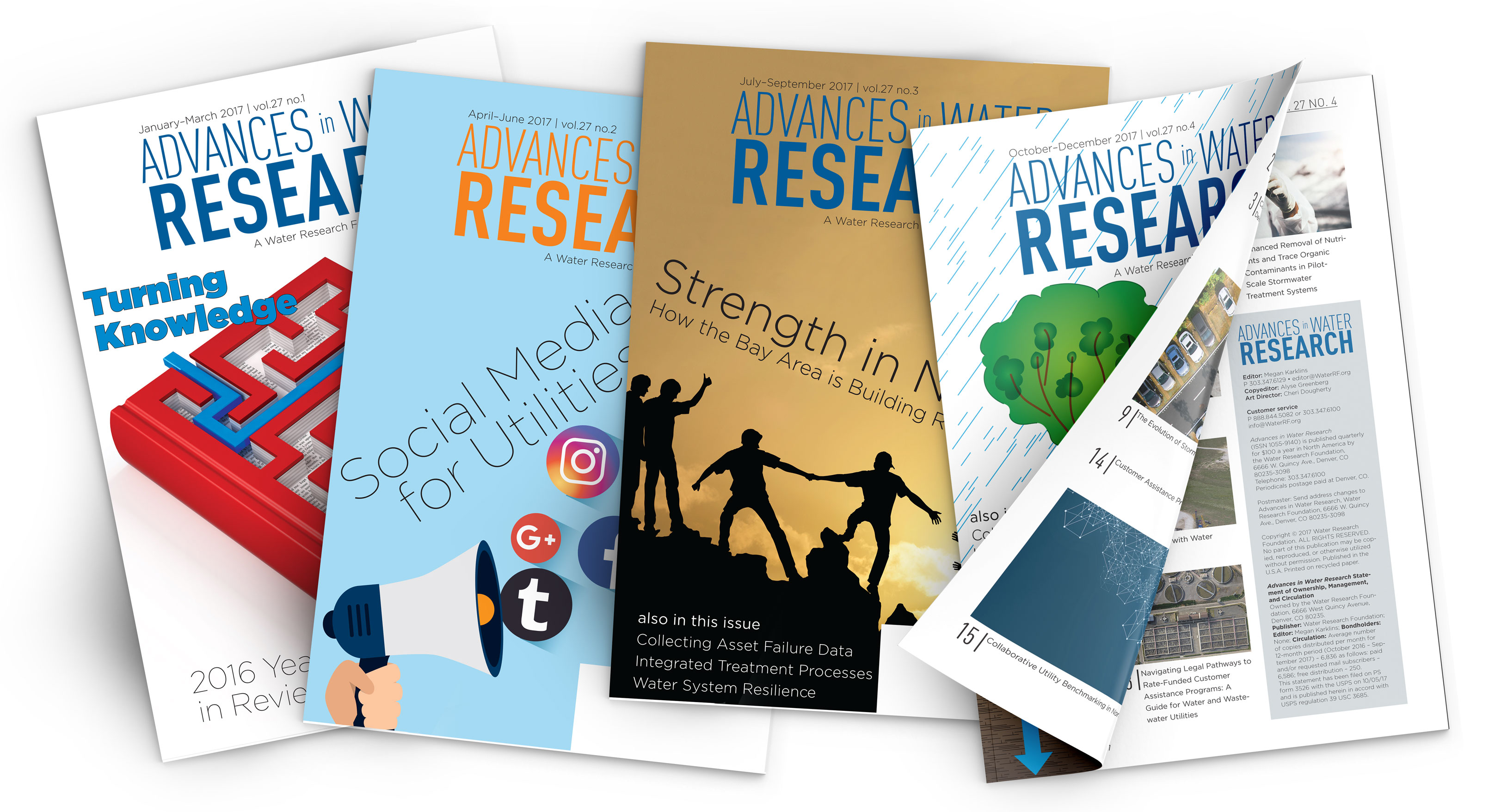
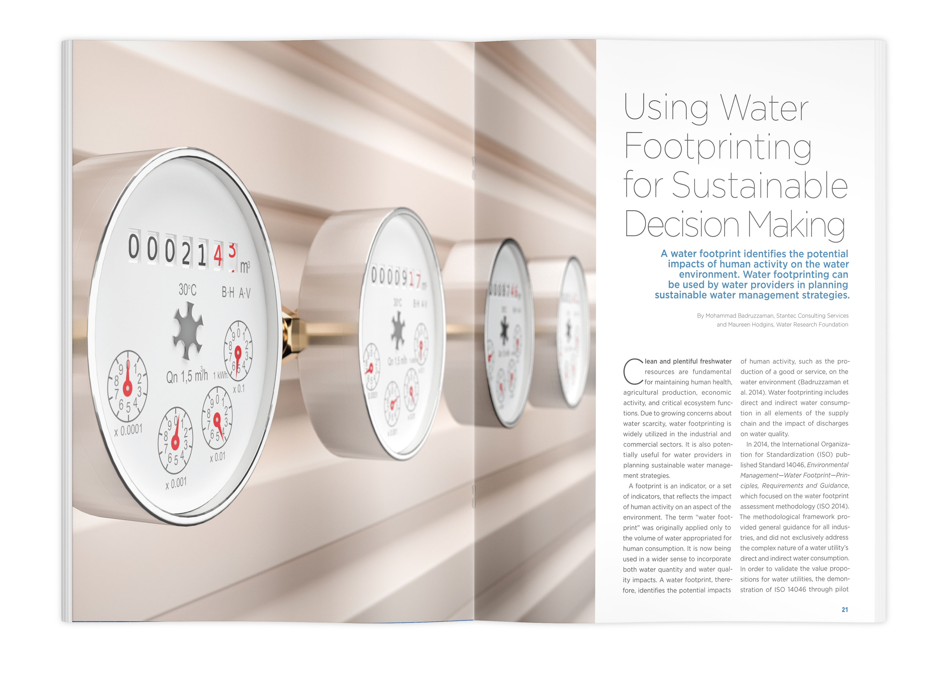
An updated brand necessitated a refresh of the Water Research Foundation’s quarterly magazine. After reviewing water-related trade magazines with a small team, we created a lists of likes and dislikes from our competition. From this list, I developed a more visual layout for our quarterly magazine. We added a calendar of water events and rather than saving all the shorter articles for the end, we dispersed them throughout the layout.
The digital version was also optimized for mobile by GTXcel. This simply required that I identify our brand colors and fonts, the rest was handled by their development team. This freed me to focus my layout efforts on the printed version.

