Tradeshow Booth
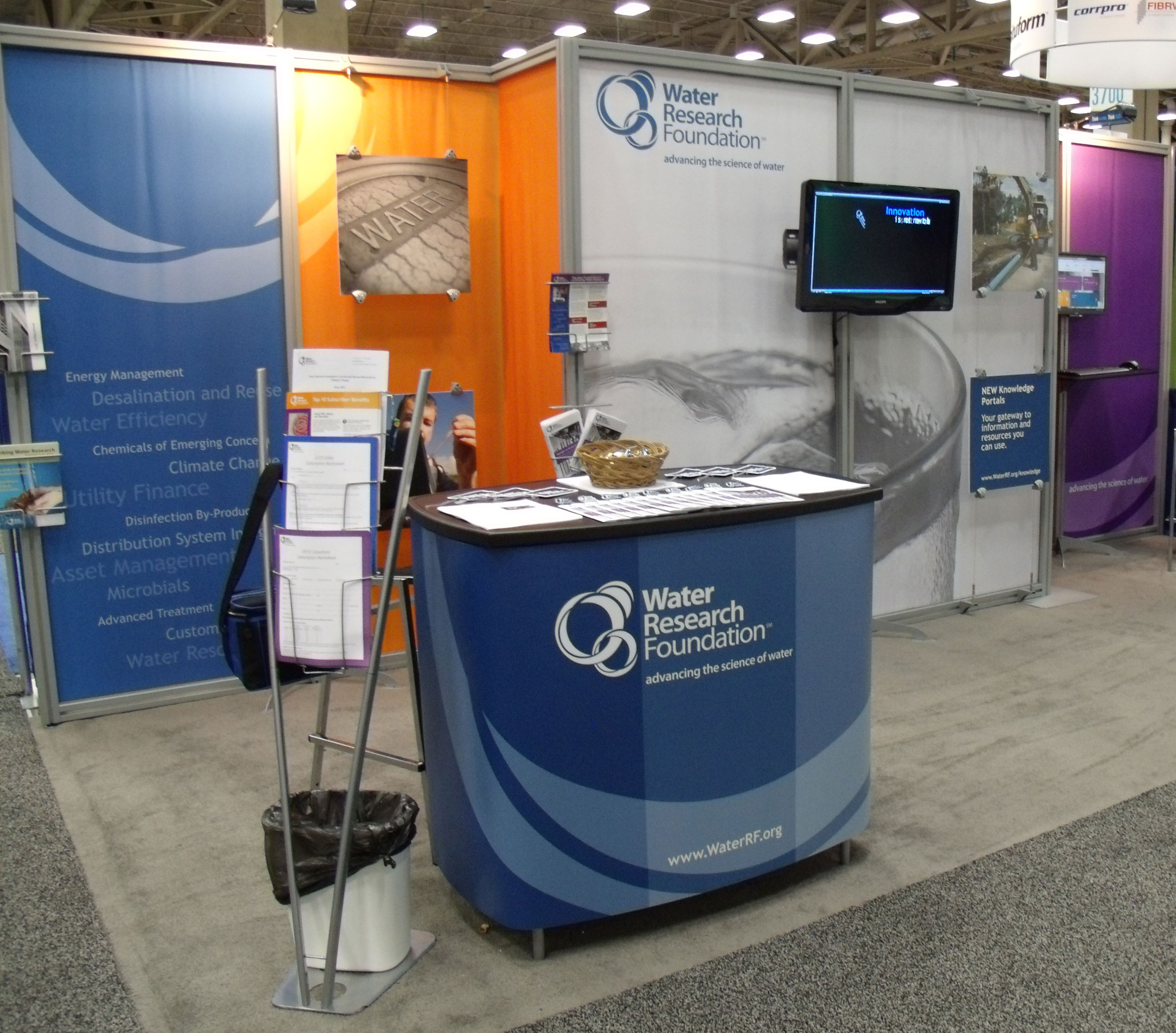
With a new structure for our 20'x20' booth space, we were able to present our message in a new way. I used the brigher secondary colors of our latest brand color palette to make the overall presentation stand apart from the various shades of blue found at the conferences we attended. Our historical focus on drinking water was showcased on the center panels. The hanging boards were used to provide a snapshot of the multitude of areas in which we provide research.

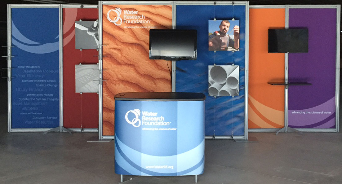
In 2014, the Water Research Foundation wanted to emphasize it's new focus beyond drinking water research. The center panels took on a more conceptual approach presenting simply textures of a barren surface paired with water.

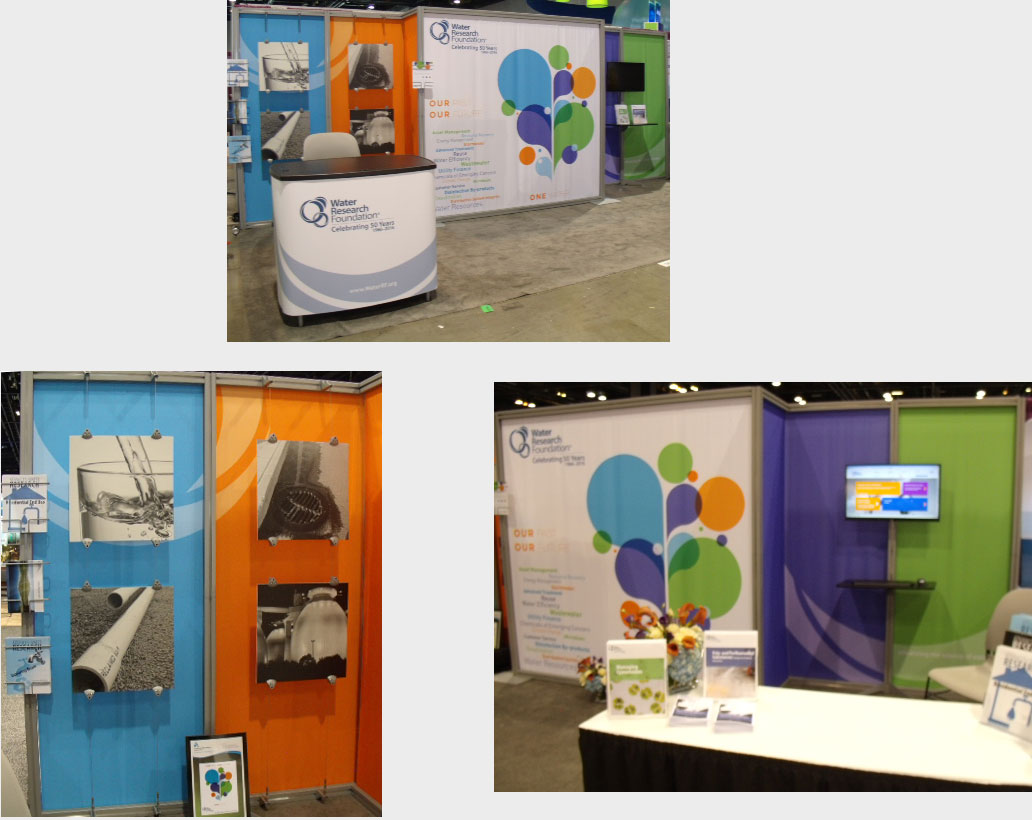
In 2016, a new "One Water" graphic was created by S&D Marketing and this became the focus of the booth. The hanging boards were again used to emphasize the diversity of the research that the Water Research Foundation sponsors.

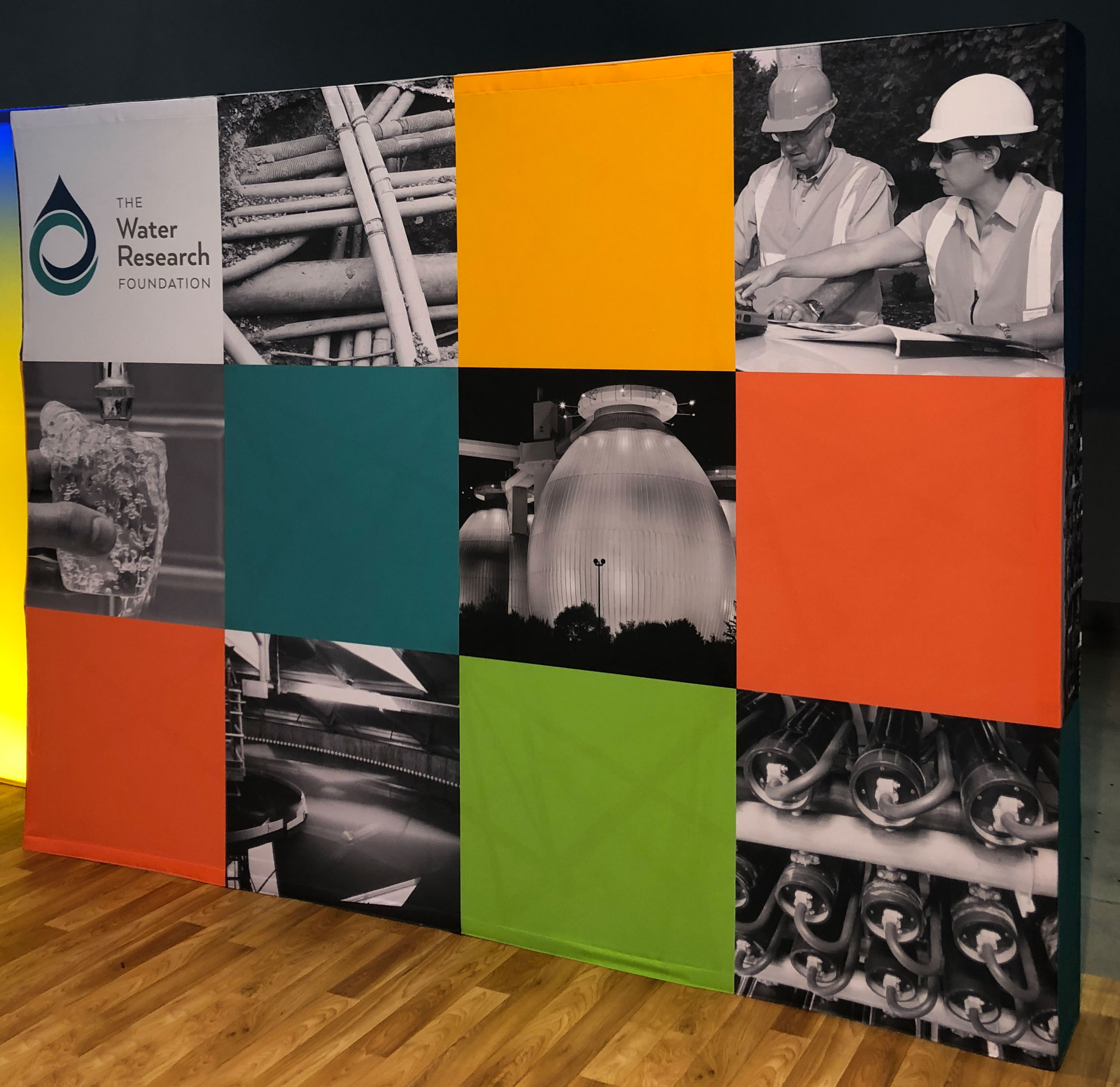
After the merger in 2018, we learned that we had been given a complimentary 10'x10' booth space at a conference coming up quickly. The Subscriber Relations Manager reminded me that we had a 10' popup structure to which we could simply apply updated graphics. I developed a showcase of our new brand and continued diversity of research offerings in less than two weeks.
I'm currently working on 4 updated options for the framework shown above.
